Absolutely every company, going with the times, has its own logo. It is an important part of the brand and image of the company, which begins to familiarize potential customers with the products or services of the organization. Externally, the logo is represented by a graphic element, which can be graphic, text, or combined.
Graphic signs demonstrate what the company does in general. The text logo includes the name of the company. As the combined variant, it includes both images and text.
Nowadays, creating a logo is not difficult. There are many software methods that allow you to get your own logo. A striking example is the generator of the logo Turbologo, the work with which exactly will not cause any difficulties. It should be understood that the logo is not a set of random elements. In it, each component has a certain meaning. This also applies to the color palette of the logo. It is worth understanding in detail, what symbolizes a particular shade.
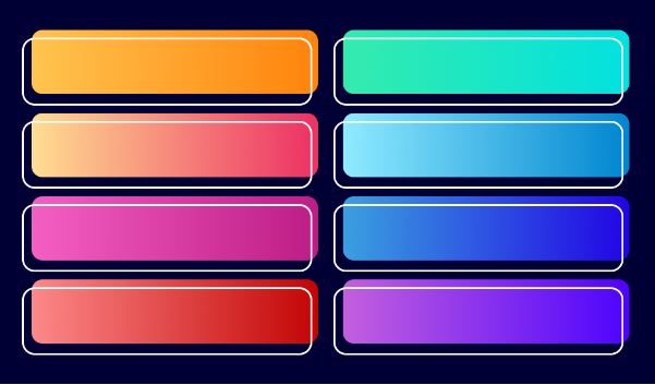
Meaning of colors
For ease of familiarity, we should list the shades and their meanings in a list:
Green. One of the most popular colors. It symbolizes safety, harmony, eco-friendliness, freshness, and novelty. It is used in the logos of famous organizations such as Subway and Nvidia. In the former, it emphasizes the freshness of products, and in the latter, it emphasizes newness;
Red. Power, aggression, courage, energy, and activity – this is what this shade is symbolized. It is found in the emblems of “CNN”, “Netflix” and others;
Yellow. Able to cause appetite, due to what yellow is used in the logo of companies specializing in fast food. Among them, are “Macdonalds”, “BurgerKing”, “DunkinDonuts” and others. In addition, yellow symbolizes optimism, logic, clarity, and confidence. Not without reason, it is used in the design of emblems of such organizations as “DHL” and “Ikea;
Black. Evokes associations with luxury, glamour, prestige, grace, and sophistication. In the black color stood the logo of very famous brands: “Lexus”, “Honda”, “Lancome” and even “Chanel”;
Purple. Hints at the creativity, mystique, and uniqueness. Encountered in the emblems of Hallmark, Cadbury, Yahoo, and others;
Blue. This shade is able to inspire confidence and calm. It is likely that for this reason it was involved in the creation of logos for General Electric, Visa, and even HP.
What to be guided by while choosing colors for a logo
Exclusively the direction in which the organization works or will work. Let’s say this is the sphere of production and sales of ecologically clean products. In this emblem must prevail green. It can be slightly diluted with a yellow shade capable of provoking appetite.
The next example is a transport company engaged in long-distance and international transport. Its logo should indicate punctuality and reliability. Thus, it will not be unreasonable to stand in blue and yellow colors. The former symbolizes trust, while the latter symbolizes clarity.
Conclusion
Colors can evoke associations with certain qualities almost subconsciously. Thus, even if a potential client does not know anything about the company, his first impression of it will be formed on the basis of the logo. Accordingly, the latter should attract and convince others to cooperate exactly with it.


