There are key elements you need to include and use correctly in a flyer to make it effective and present your company well.
Making an effective flyer does not require that you follow a recipe. But, these tips will help you create a more effective flyer.
We know how to design flyers for all occasions, whether it’s for an event, party, business, or hobby. From how to create an awesome flyer from scratch to collections of stunning flyer templates, our feature on free design templates for flyers has everything you need to start designing immediately.
-
Make a Catchy Headline
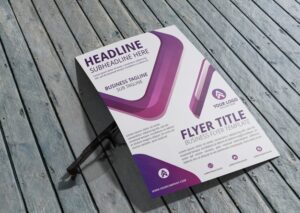
Your flyers should contain an eye-catching headline, as this is what people will see first. In the case of an enticing headline, people will certainly peruse the rest of the article. The summary should be short, potent, and contain a powerful phrase or sentence that accurately summarizes your message.
Following the definition of your purpose, you’ll want to create a headline that will catch the viewer’s attention. You want it to be interesting because it will probably be read first on your flyer.
-
Transparency is Key
Put only the necessary information on your flyers, and don’t add too much text. A piece of writing that goes on and on about the same thing or that contains so much unrelated information will not be read by many people. Keeping your flyers short is the best thing you can do. Make sure that you don’t overburden them with information. An event’s precise location and time, especially its address, should be clearly indicated.
-
Having a Specific Goal or Purpose
Why is it important for you to design a flyer? Focus on one aspect of your business you’d like to promote, whether it be to sell a certain product, invite customers to an event, or use a particular service.
Take this example into consideration. Creating a flyer that promotes a BOGO (Buy One Get One) sale will help clear the old product off the shelves so that room can be made for the new product. Should the newly-released product be featured on the same flyer? If the shelf space is first to be cleared, that’s redundant.
Would it not make sense for a sophisticated consumer to wait for the next version of a product? It is wise to free flyer design that has a specific objective in mind. When the reader focuses on the most important message, he will be enlightened and driven. If they are related to the same goal, you may put two things on the flyer at once.
-
Insert Images and Graphics

Use eye-catching images and photos about the event that say something and reflect the meaning of the occasion. The images on the flyer should be clear, high-resolution, and match the flyer’s colors. Having great images will make people more inclined to read the flyers, so make sure to have them prominent on the flyers.
You should use vivid images to illustrate the concept of the flyer and eye-catching images to catch people’s attention. You should place your company logo on the flyer, too.
-
Simplicity is the Key
Your flyers shouldn’t be too complicated to read. People might not be interested in reading the flyer if they don’t see at first glance what it’s about. Additionally, the text should be placed on a plain background, because otherwise, it won’t be as easy to read. Use one font instead of too many, it makes the text look unprofessional.
-
Your Contact Information
You must include this on your flyer. In the absence of a phone number or address, how can anyone get in touch with you? In addition, you could include information such as your name, website, e-mail address, Facebook page, and Twitter handle.
The effectiveness of your flyer depends on how carefully all these elements are combined. If you are designing a flyer or any other print material, you must also consider the graphic design basics and color theory pages.
-
Short and Simple Text is Best
When writing the text, pay attention to the details. People of all backgrounds will look at this flyer. You want it to be brief, but clear and straightforward. On the flyers, don’t use phrases which only you and a few other people understand.
-
Colors With Contrast Are Best
A flyer can be enhanced by the use of colors. Utilizing contrastive colors, you can make certain areas of the flyer more visible while others are less visible. There should be a clear message about the event in the headline and some clear information about the event in the body of the flyer.
-
Choose Good Quality Paper
Choosing a high-quality paper is crucial. You will demonstrate that this is a serious issue if you use high-quality paper. Printed flyers that are on glossy paper will also look better, and if you want to appear professional, make sure that you use this type of paper.
-
Don’t Overdo Colors
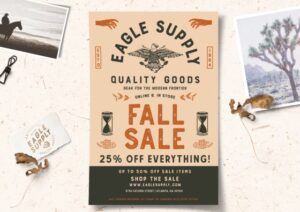
Your flyers should not be too colorful. Flyers with more colors tend to draw more attention. This is a mistake some people make. When you look at a flyer with too many bright colors, you will find it incredibly disconcerting. Your eyes will have a difficult time making out the pertinent information. People are less likely to take the time to figure out what the flyers are about if the flyer is a jumble of colors and images.
-
Emphasize Relevant Information
Free or discounted items, promotions, or other items connected to the event should be easily visible at first glance. The possibility of winning something, free gifts, and similar things appeal to many people.
-
Motivating Messages Overall

You may use this line to ask for action. In order for the flyer to have any value, it must contain a call to action, otherwise, the reader will not take action. Make sure the reader knows what to do after reading the article by using words such as buy now, call now, contact us, come in, and enter to win.
Read also – HALLOWEEN COSTUME PARTY FLYER IDEAS


